Statistics’ page allow you to track your augmented markers, informing you about the number of scans & clicks generated for each of them. You will also be able to know how many users used the application, on which device, …
You can find the Statistics’ page in the menu of your Bear GO platform. 
Graphics – Overview
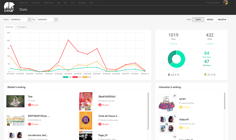
A graph with 3 curves shows you the evolution of your markers over time:
- The green curve represents the number of users who launch the application
- The red curve represents the number of markers scanned
- The yellow curve represents the number of clicks on the markers’ interactions
You can choose to display the curves of your choice, by clicking on the graph legend. 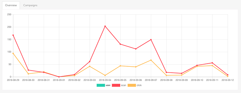
You can also define the period over which the statistics are displayed. By using the Calendar, you can choose a start date and an end date, and the graph will automatically update itself. You can also set the graph to a monthly, weekly or daily period.
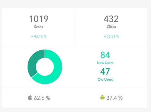
On the right part, the most important statistics are summarized in figures, by showing you a percentage of:
- Scans
- Clicks
- News users
- Old users
- Percentage of user on Android & IOS devices
Marker’s ranking
All markers are classified according to their number of scans, in ascending order. 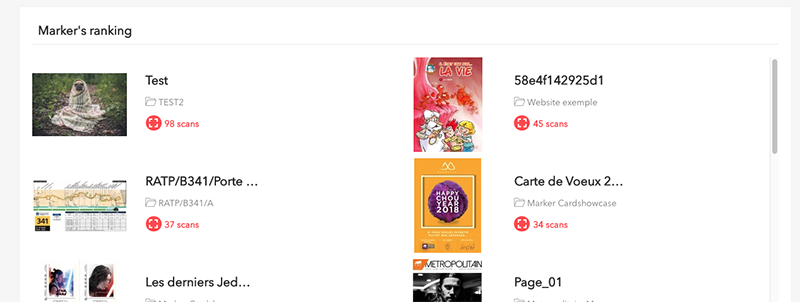
Interaction’s ranking
All assets are classified according to their number of clicks generated, in ascending order. The icon in the corner of the image shows you the type of interaction. 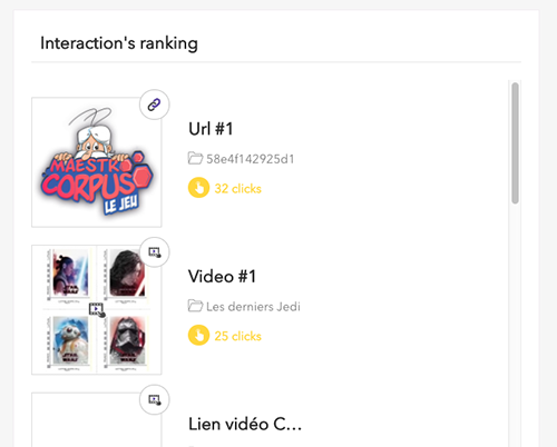
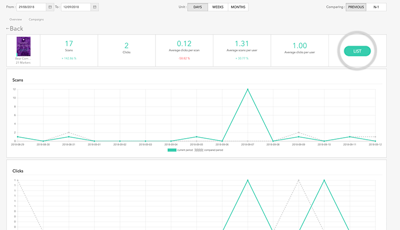
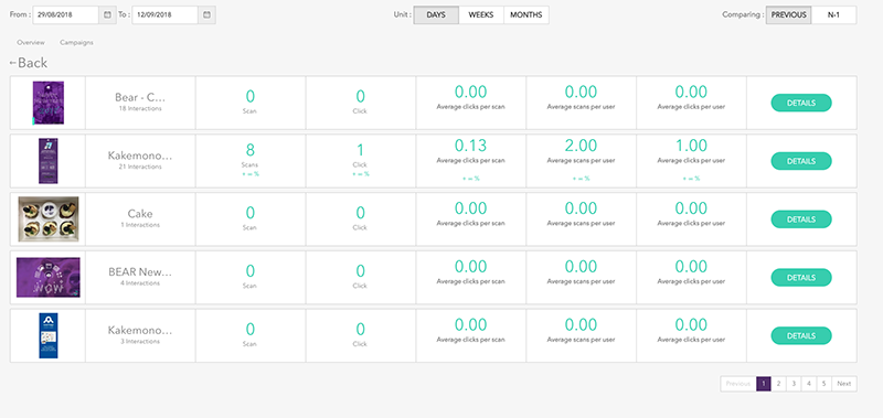
View Campaigns
By clicking on the Campaigns tab you can see all campaigns and their statistics. 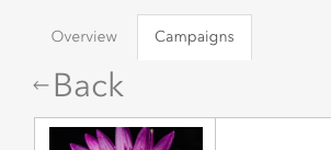
By clicking on DETAILS you access to the details of the campaign. 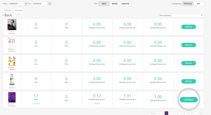
You can click on LIST to discover the statistics of all markers contained in this campaign. As with campaigns, you can access to the details of each Marker.