This article is a guideline to create the best AR experience through the Bear GO platform. It may be of interest for users of the Bear SDK, Bear Lite app or White Label apps developed by BEAR
Our technology is able to add AR content on Print markers (physical images on which you will place your AR content) by analyzing their visual features. Following points describe some best practices to optimize marker recognition and tracking stability.
Optimal dimension
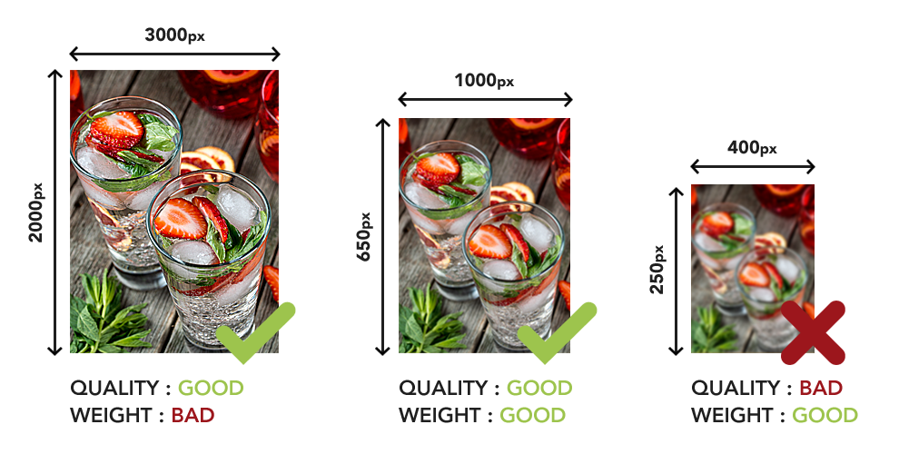
In order to be correctly recognized and tracked, your markers must have a minimum size ranging from 500px to 1000px on the largest side. Keep in mind that beyond 1000px, you will not get a better image recognition.
So a 3000px height and 10MB weight marker will not be better recognized than a 1000px height and 1MB weight one. We also recommend uploading images weighting between 100KB and 1MB to prevent any lag while working on the platform.
Aspect ratio
Keep in mind that most users will scan your markers with their phone in vertical orientation. To follow this behavior, we highly recommend to create markers vertically-oriented rather than horizontally, so users’ camera will capture the overall marker during the AR experience. If your markers are larger than higher, users’ camera may only see a portion of them, or they may be tempted to hold off from it to get a wider view and so, lose the tracking.
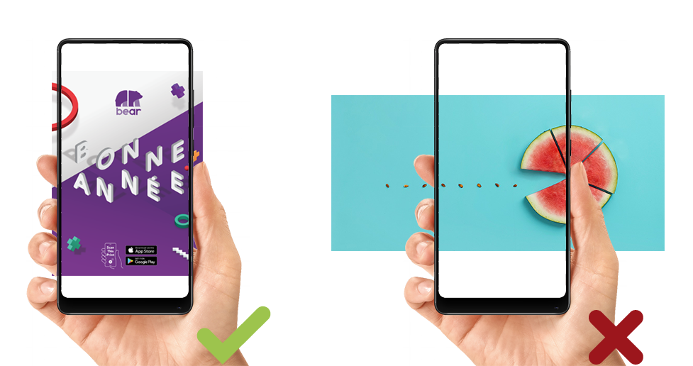
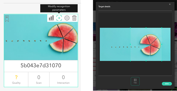
If you cannot avoid wide marker, it may be relevant to focus on a specific area of it or give you users clear instructions about what area they should aim at. You can use the recognition parameters right inside our platform to do that.
Features
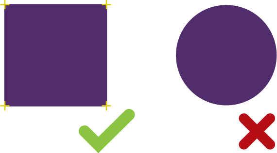
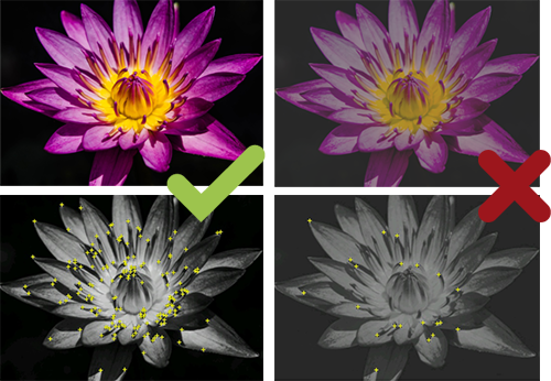
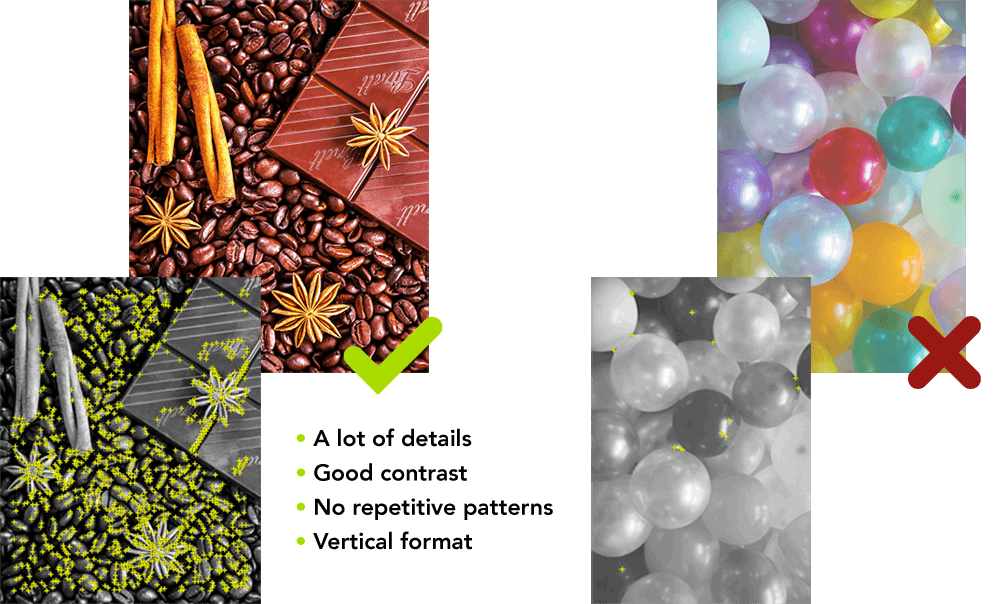
A feature is a sharp, spiked, chiseled detail in your markers. To get a stronger recognition and tracking stability, your markers need as many features as possible. We will see how to get lots of features in your markers (shown in the next examples as the yellow cross), but the easier way is to display many pointed sharp.
For example, a simple square has 4 features, one for each corner, and a circle has 0 feature. In that case, even 4 features won’t be enough to get a good recognition of your marker but it is a good start.
Contrast
High contrast can increase the number of features in your markers. But it is difficult to detect the perfect contrast for our system with your eyes. We recommend you to level up the contrast of your markers in general and choose a picture with a lot of details. Organic shapes, round details, blurred, or highly-compressed images do not often provide enough richness in detail to be detected and tracked properly.
Please note that our system only see you markers in black and white, so you will not get better results by enhancing color’s contrast only.
A good recognition but a bad tracking, why?
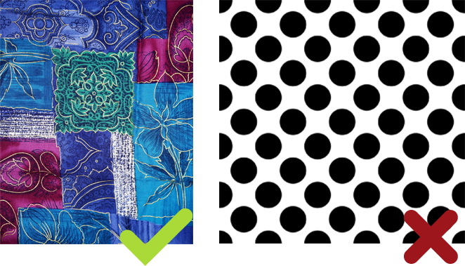
In some cases, it is possible that your target gets a good recognition but a bad tracking during AR experience. For instance you may have a lot of features but in case image includes repetitive patterns, our system will be lost because most features are just the same.
Examples
Here is a comparaison between a good and bad marker :
Transparency
Marker’s transparency can’t be detected. So use a white background and export your markers as JPEG, PDF or PNG without transparency layer.
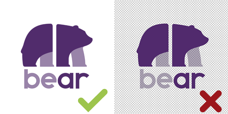
Your markers may be extracted from objects provided that users can scan a flat surface. However, transparency must be taken into account. If the image we upload to the platform changes according to light conditions and objects reflecting around, then tracking will be disturbed.
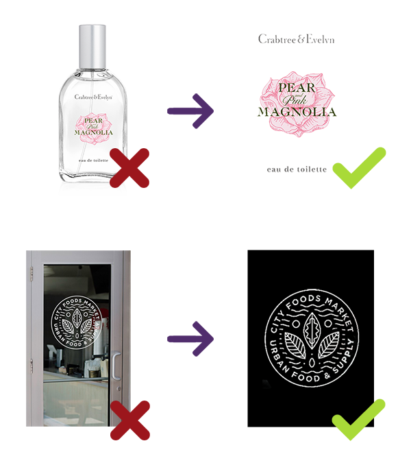
Glossy reflections
Under ambient lighting conditions, a glossy surface is not a problem. But under certain angles, some light sources can create glossy reflections and limit the recognition or the tracking of you markers.
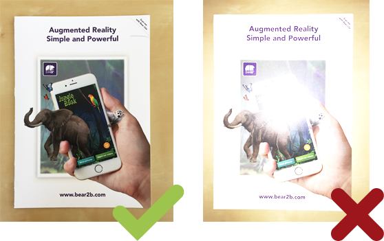
Duplicates
If two markers are visually close the platform might notify you of a possible duplicate. It might happens if you upload the same marker in two different color contrasts or if some elements of a marker are present in another marker. If you are in a situation where you think there should not be a duplicate please contact us as we also offer advanced image recognition features that will help you solve complex duplicate issues.
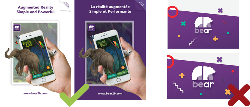
Border image target
When you upload a marker to the platform, our recognition engine will automatically focus on it removing a small section on each border inside your marker. It is important to verify that none of your visual elements are too close to the borders, so all of them will be taken into account during the scan and optimize the recognition and tracking.
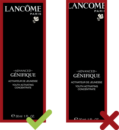
Folded markers
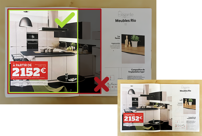
We strongly advise you not to use folded markers, because this can interfere with tracking. For example, if your marker is an image on two pages of a magazine, if you turn a bit the right page, the augmentation will try follow both pages at the same time and this will result in a bad AR experience. So, it is better to leave the marker on one page rather than two.
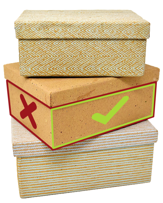
Same advice for packaging: you should not use two sides in one marker, or you will get bad tracking.
“Fly-to-screen”
Fly-to-screen occurs when users move their phones away from the markers. In that case, marker will be displayed centered and fixed on screen. To get an optimized fly-to-screen experience, you should center all assets on the marker so they will be visible on screen and users will still be able to watch the full AR scene, even without tracking.